Fedex ad design

AD_Page_1Untitled-1_Page_1AD_Page_3AD_Page_4AD_Page_5Untitled-1_Page_2AD_Page_7AD_Page_8

Minimum Expectations

  • Pick an Ad
    • Well designed
    • At least one line of text
    • The company logo should be included
    • Vector or raster based
  • Create New Ad (This does not need to be a creative ad)
    • Create a new unique ad (Photoshop or Illustrator)
    • Match dimension of original ad (150 resolution)
    • Must look like it is from the same campaign (Design, colors, typography, layout, visuals, message, etc)
    • Type in your text (don’t copy/paste text or other elements from from original ad)
    • Images or graphics need to be legally obtained (See course media usage requirements.)
    • Find and use logo of company (fair use will apply here)
  • Presentation Slide Design
    • 6+ consistently designed slides (Use InDesign to layout slides – pull in ads from Photoshop or Illustrator)
    • Reverse engineer original ad (Design | Color | Typography – pull out specific talking points over multiple slides)
    • One or more slides pointing out what makes your new ad fit the campaign
    • 10in by 7.5in slide size (InDesign document setup)
    • One idea per slide
    • 1+ slide introduce company and campaign
    • Avoid bullet points
  • Save as multi-page PDF and individual JPGs (Include either or both on your blog post)
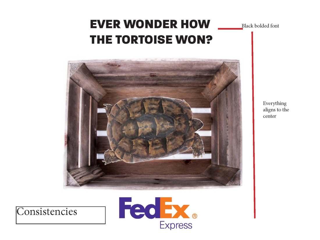
Attribute

wooden box- George Hodan CC0 Public Domain

tesudo graeca 

Vicente.niclos

Audience

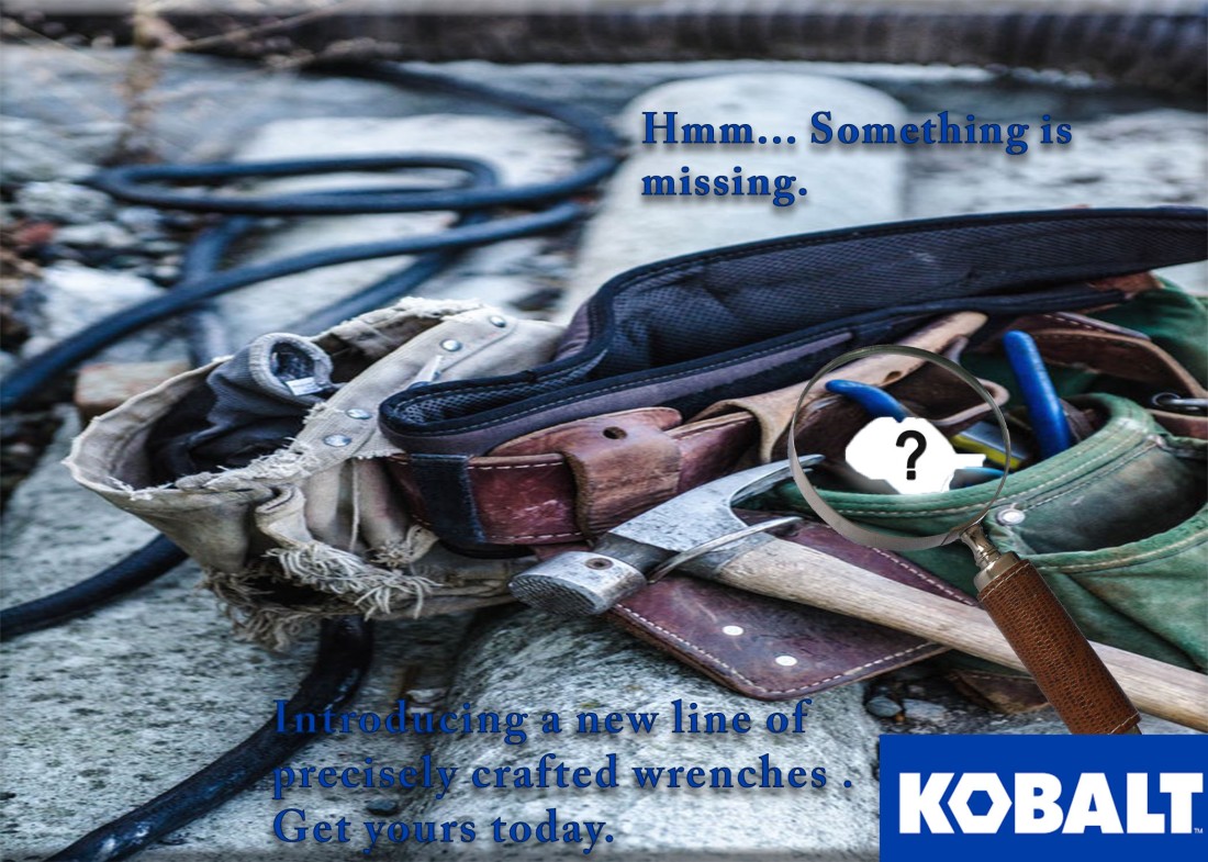
My intended audience was for adults that are wanting to ship things fast. It incorporates a nostalgic touch with the storybook tale, as well as a little bit of humour.

Design Analysis

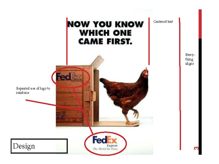
The design is simple with a white background so that it looks similar to the campaign. The font is sans seriff and was as similar as I could find to the campaign font.

Kobalt ad

Intro

This week I worked on an ad design for Kobalt, to try and promote their brand for wrenches. It was interesting how much though actually had to go into this project for as simple that it looks.

magazine ad final.jpgBlog final ad.jpg

requirements


  • Use the generator below to choose a household or office product and target audience
  • Determine a specific brand for the chosen product
  • Include the company logo in the design (see the course fair use guidelines)
  • 2+ images blended (don’t need to be original, but need to be legally obtained. (See course media usage requirements.)
  • Symbolic visual communication (avoid literal)
  • Written content
    • Original and creative headline (must coincide with visuals)
    • Body copy (1-2 sentences)
    • Call to action (tell the viewer what you want them to do)
  • Two of the following mediums will be used to execute your design. It will be the same design in two different sizes. The Media Consumption section of the Project Specifications Generator will determine which two mediums you will use.
    Document Setup – Watch this video on how to setup your Photoshop document
    Resize Project – Watch this video on how to resize your project to fit a different sized document

    • Magazine Ad (Two size options)
      • Magazine Full Page Ad – 8.5” x 11” (150-300 resolution/dpi)
      • Magazine Half Page Ad – 8.5” x 5.5” (150-300 resolution/dpi)
    • TV Static Ad – 1920px by 1080px (150-300 resolution/dpi)
    • Web/Blog Static Ad – 300px by 250px (72 resolution/dpi)
    • Facebook Static Ad – 400px by 209px (72 resolution/dpi)

Attribute Photos

The tool belt photo is available by https://unsplash.com taken by Jessica Orrico and is available for CC0 public domain

The magnifying glass is available by https://pixabay.com by Davie Bicker CC0

The question mark is available on http://www.publicdomainpictures.net by Bob Williams

CC0 Public Domain

Target Audience

My target audience was male and female ages 45-54 that were married, with a high school education. Their income was on the higher end with 60-89,000 and received media consumption generally through blogs and magazines.

Design Analysis

The goal of my ad was to appear simple while using an idea that was familiar to that age group and a brand that is used by them. Kobalt is a brand used fairly commonly by men and women and can be higher end in some tools so it could help appeal to the target. The worn tool belt is a familiar sight to a lot of the target audience and by implying that something could be added to the trustworthy tool belt to make it better was my goal.

The color of the font was the same as Kobalt’s brand of blue to enforce the repetition that can help leave a lasting effect on the viewer. The question mark was used to simplify what was missing.

Conclusion

Overall I am happy with the design and result of the project. The magnifying glass was difficult to find and I would prefer a different one but it will work for this to get the message across.


Icons final draft

Minimum Expectations

  • Use Illustrator
  • 4-6 Original Icons (no symbols)
  • All original work
  • Each icon communicates a single message
  • Set of icons are consistently designed
  • No text, gradients, drop shadows, pixels, raster effects
  • Include the following images in the blog post (Video instructions to export PNG images from Illustrator)
    • One 9in by 6in PNG image with all the icons
    • Individual PNG icons each 60px by 60px
    • Individual PNG icons each 400px by 400px

Introduction

For this project, I designed 5 icons that represent nature to me. This was done with adobe illustrate and was really fun. My targeted audience was for adult audiences by means of simple designs. The icons were chosen because when I think of nature, these are the first things that come to me. They were designed so that they could appear simple, yet be clear as to what they are.


Icons

The sunflower was done with rotation and reflection primarily to make it look uniform and clean.

flower

The earth used a more abstract view to show the continents because with the size and complexity of the exact continents.

earth

The cloud was made with circles combining them and reflecting the water drops.

cloud

The tree was the simplest of the icons being made of 3 shapes. Attempts were made to go more into detail, however it lost its icon status to me and became more of an illustration.

tree

The leaf follows on the tree as being simplified to not appear to complex of an icon.

leaf

Conclusion

To conclude this was a very fun assignment that was challenging but was good at learning the experience. I hope my designs were clear and after receiving the critique on Facebook it helped to understand just what to do.

Reverse engineering photography

A photo is worth a thousand words, as the saying goes. Though I may not say a thousand words, my goal is to show some of what these photos mean and say indirectly and directly.


jonathan glynn-smith 3rds.jpegjonathan glynn-smith 3rds.jpg

The rule of thirds

Photo credit to Jonathan Glynn-Smith on http://www.jonathanglynnsmith.com.

This photo does a great job of utilizing the rule of thirds by putting the car(focus) in the center of the photo in the bottom two intersection points.

Leading lines

jonathan glynn-smith leading.jpegjonathan glynn-smith leading.jpg

This photo( also by Jonathon Glynn-Smith on http://www.jonathanglynnsmith.com) does a great job at leading the viewer. The lines aren’t the clearest but I feel like it goes with the feeling of the photo of speed and almost fluidity to the photo.

Depth of field

jom richardsen depth.jpgjim richardsen depth.jpg 
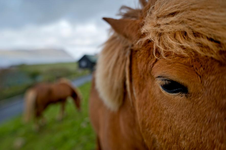
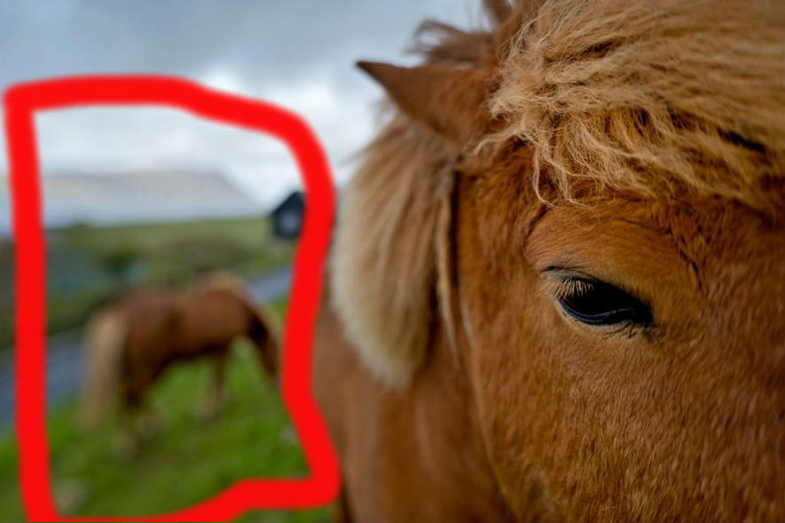
This photo (by Jim Richardson http://www.nationalgeographic.com/photography/photo-tips/out-of-focus-richardson/#/22754.jpg) shows the focus of the pony’s face/eye while having the background clearly present, though blurred. It does well at showing that this photo isn’t just superficial in showing the pony but goes deeper.

Conclusion

Photography is a powerful tool that can help convey a message in ways that words sometimes just can’t. By knowing these different ways of presenting the photo, individuals can more effectively convey the message.

Typography in Burning Man by Devan Hoyt

This website is from burningman.org, and I feel like it is a decent website with contrasting typography.burningman_org-1.jpg

Slab Serif

burningman_org-1 slab.jpg

This text has a vertical stress to it, while maintaining thickness. It doesn’t really have any transition to it and is fairly consistent throughout.

burningman_org-1 decorative.jpg

This font is decorative in its feel to me because of how unique and striking it is. It is extremely thin and almost as Matchwood. It is very informal and is a good decorative use.


Conclusion

The fonts used in the text were good and helped with the tone of informality because this is a site for a festival. It contrasts well from going from a bold and dark text to a more light and decorative text.

Understanding Samsung

Samsung has made a masterful and quite beautiful home page, that does a good job of showing off their newest phone addition.

http://www.samsung.com/us/

This image was created in order to promote their new flagship phone, the Galaxy Note8.

www-samsung-com-1.jpg

color.jpg

The color at the top of the page is Samsung blue and gradually transitions into a more sky colored blue. In my opinion it does a really good job of incorporating their own colors into a natural thing.contrast.jpg 
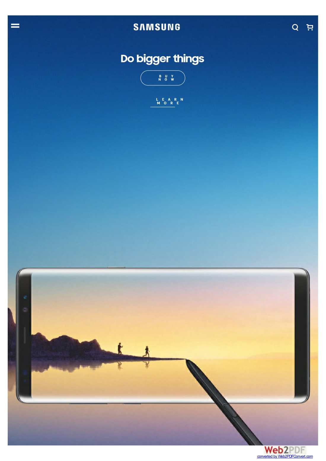
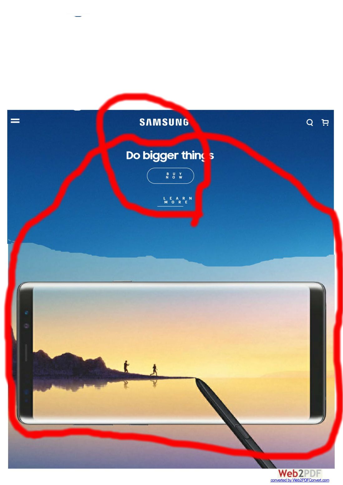
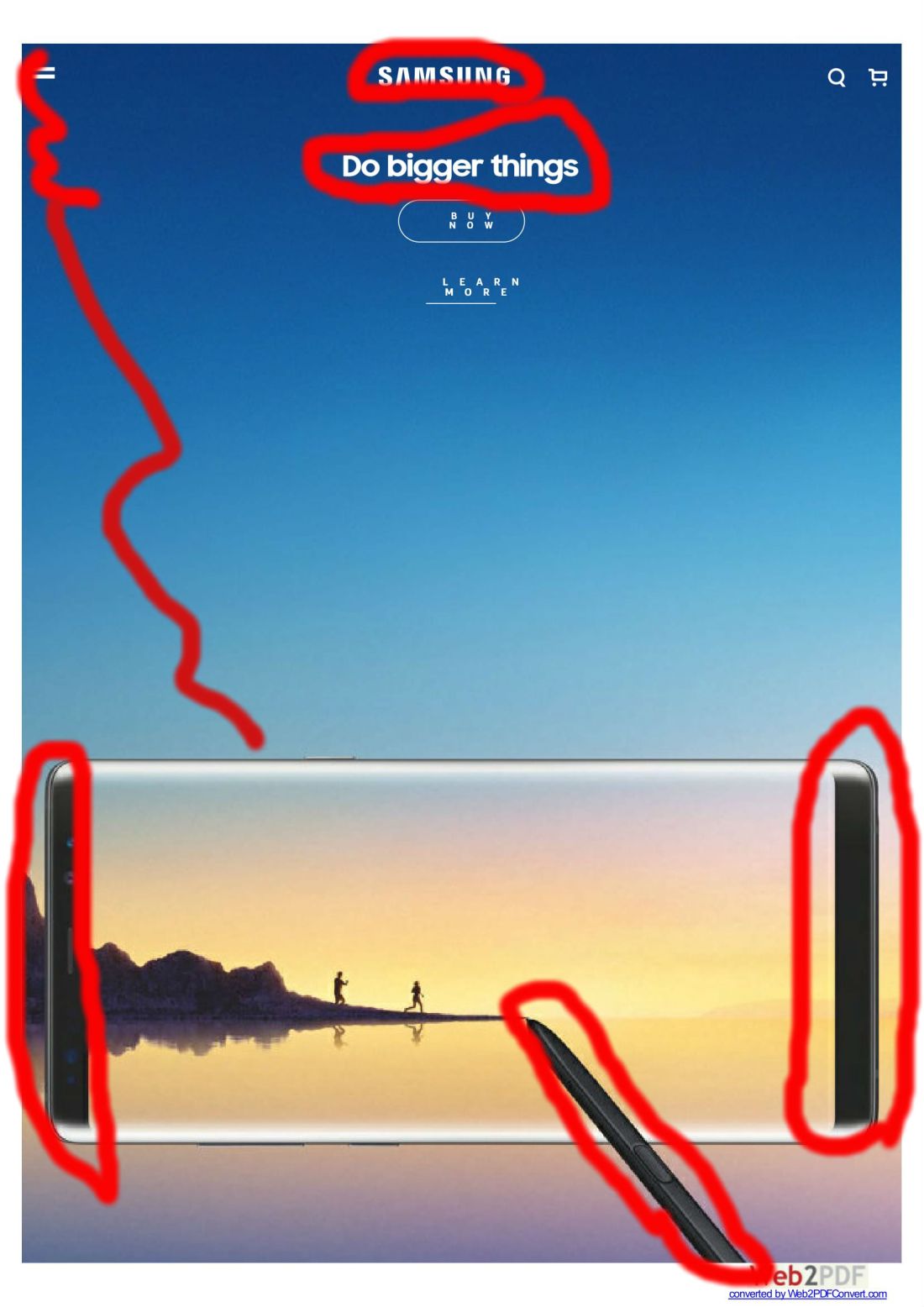
The contrast of the sides of the phone make this look almost like a mirror instead of a phone, giving the impression of just how clear the phone could be. The white words also give the impression of a clean separation between background and whats being said.repition.jpg The logo “samsung” is seen several times in the webpage, only once though in this screen shot. It is also on the stylus and a few other places when you first get on the site and scroll a little.

proximity.jpg

Though this screenshot didn’t come out right, it is closer to how I edited it when you enter the site. The phone is close to the words “Do bigger things” which to me gives the impression that the phone is large. The logo is also close to the phrase which could lead to associating one with the other.alignment.jpg

Overall the alignment was very clean and grid like. The phone is directly bellow the wording and even with the edge of the screen.

Conclusion

A very well done site that incorporates certain aspects, such as the logo and color associated into a newer design that flows very well. It does a good job of promoting the product while reminding you of where it comes from.