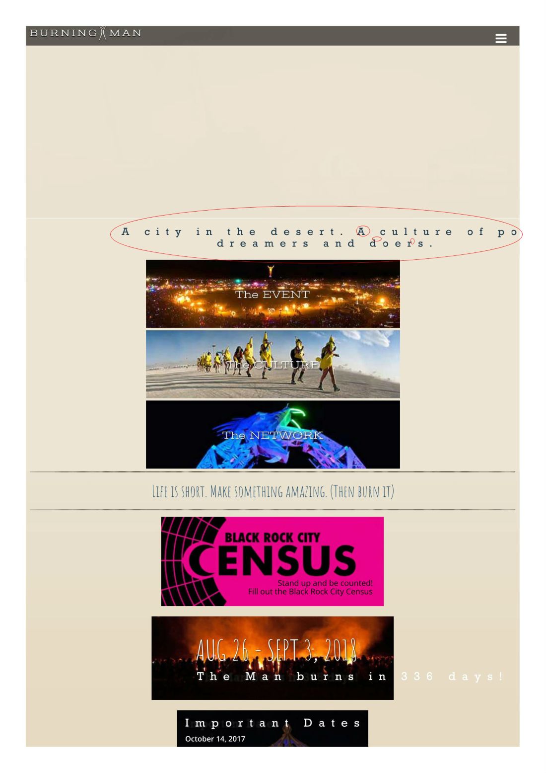
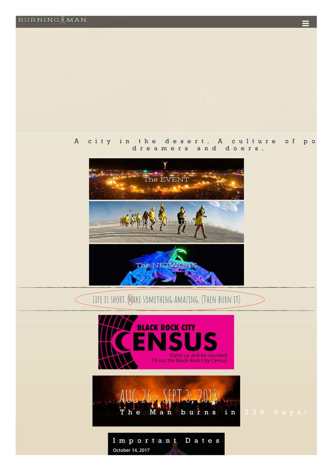
This website is from burningman.org, and I feel like it is a decent website with contrasting typography.
Slab Serif

This text has a vertical stress to it, while maintaining thickness. It doesn’t really have any transition to it and is fairly consistent throughout.

This font is decorative in its feel to me because of how unique and striking it is. It is extremely thin and almost as Matchwood. It is very informal and is a good decorative use.
Conclusion
The fonts used in the text were good and helped with the tone of informality because this is a site for a festival. It contrasts well from going from a bold and dark text to a more light and decorative text.