Intro
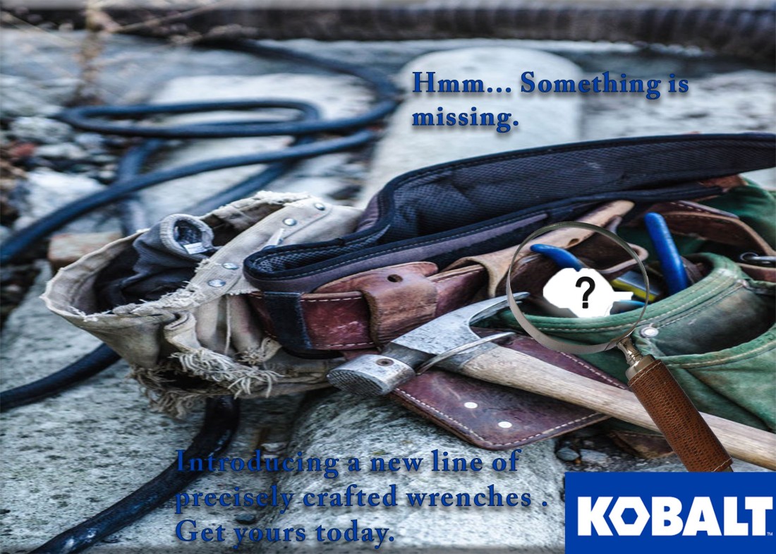
This week I worked on an ad design for Kobalt, to try and promote their brand for wrenches. It was interesting how much though actually had to go into this project for as simple that it looks.
requirements
- Use the generator below to choose a household or office product and target audience
- Determine a specific brand for the chosen product
- Include the company logo in the design (see the course fair use guidelines)
- 2+ images blended (don’t need to be original, but need to be legally obtained. (See course media usage requirements.)
- Symbolic visual communication (avoid literal)
- Written content
- Original and creative headline (must coincide with visuals)
- Body copy (1-2 sentences)
- Call to action (tell the viewer what you want them to do)
- Two of the following mediums will be used to execute your design. It will be the same design in two different sizes. The Media Consumption section of the Project Specifications Generator will determine which two mediums you will use.
Document Setup – Watch this video on how to setup your Photoshop document
Resize Project – Watch this video on how to resize your project to fit a different sized document- Magazine Ad (Two size options)
- Magazine Full Page Ad – 8.5” x 11” (150-300 resolution/dpi)
- Magazine Half Page Ad – 8.5” x 5.5” (150-300 resolution/dpi)
- TV Static Ad – 1920px by 1080px (150-300 resolution/dpi)
- Web/Blog Static Ad – 300px by 250px (72 resolution/dpi)
- Facebook Static Ad – 400px by 209px (72 resolution/dpi)
- Magazine Ad (Two size options)
Attribute Photos
The tool belt photo is available by https://unsplash.com taken by Jessica Orrico and is available for CC0 public domain
The magnifying glass is available by https://pixabay.com by Davie Bicker CC0
The question mark is available on http://www.publicdomainpictures.net by Bob Williams
Target Audience
My target audience was male and female ages 45-54 that were married, with a high school education. Their income was on the higher end with 60-89,000 and received media consumption generally through blogs and magazines.
Design Analysis
The goal of my ad was to appear simple while using an idea that was familiar to that age group and a brand that is used by them. Kobalt is a brand used fairly commonly by men and women and can be higher end in some tools so it could help appeal to the target. The worn tool belt is a familiar sight to a lot of the target audience and by implying that something could be added to the trustworthy tool belt to make it better was my goal.
The color of the font was the same as Kobalt’s brand of blue to enforce the repetition that can help leave a lasting effect on the viewer. The question mark was used to simplify what was missing.
Conclusion
Overall I am happy with the design and result of the project. The magnifying glass was difficult to find and I would prefer a different one but it will work for this to get the message across.


 This photo (by Jim Richardson