A photo is worth a thousand words, as the saying goes. Though I may not say a thousand words, my goal is to show some of what these photos mean and say indirectly and directly.


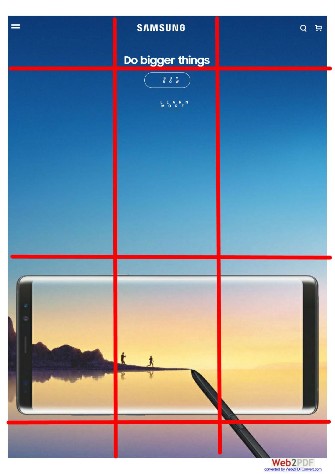
The rule of thirds
Photo credit to Jonathan Glynn-Smith on http://www.jonathanglynnsmith.com.
This photo does a great job of utilizing the rule of thirds by putting the car(focus) in the center of the photo in the bottom two intersection points.
Leading lines

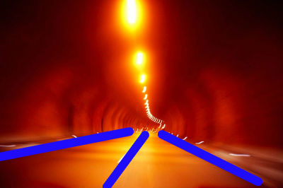
This photo( also by Jonathon Glynn-Smith on http://www.jonathanglynnsmith.com) does a great job at leading the viewer. The lines aren’t the clearest but I feel like it goes with the feeling of the photo of speed and almost fluidity to the photo.
Depth of field
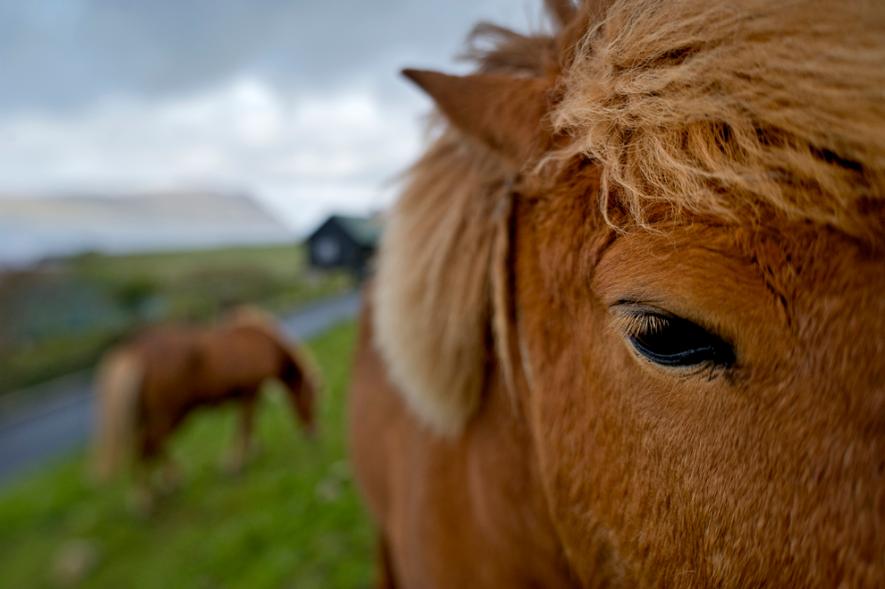
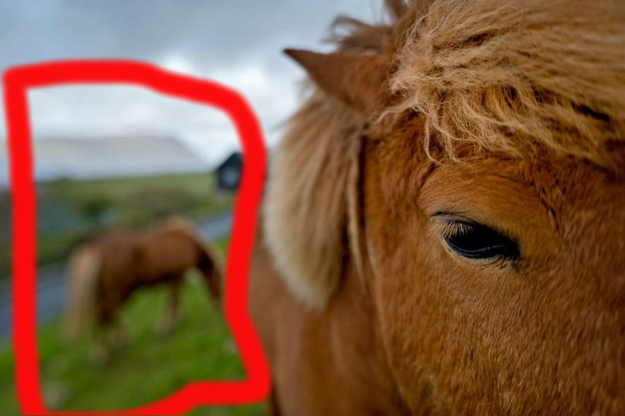 This photo (by Jim Richardson http://www.nationalgeographic.com/photography/photo-tips/out-of-focus-richardson/#/22754.jpg) shows the focus of the pony’s face/eye while having the background clearly present, though blurred. It does well at showing that this photo isn’t just superficial in showing the pony but goes deeper.
Conclusion
Photography is a powerful tool that can help convey a message in ways that words sometimes just can’t. By knowing these different ways of presenting the photo, individuals can more effectively convey the message.

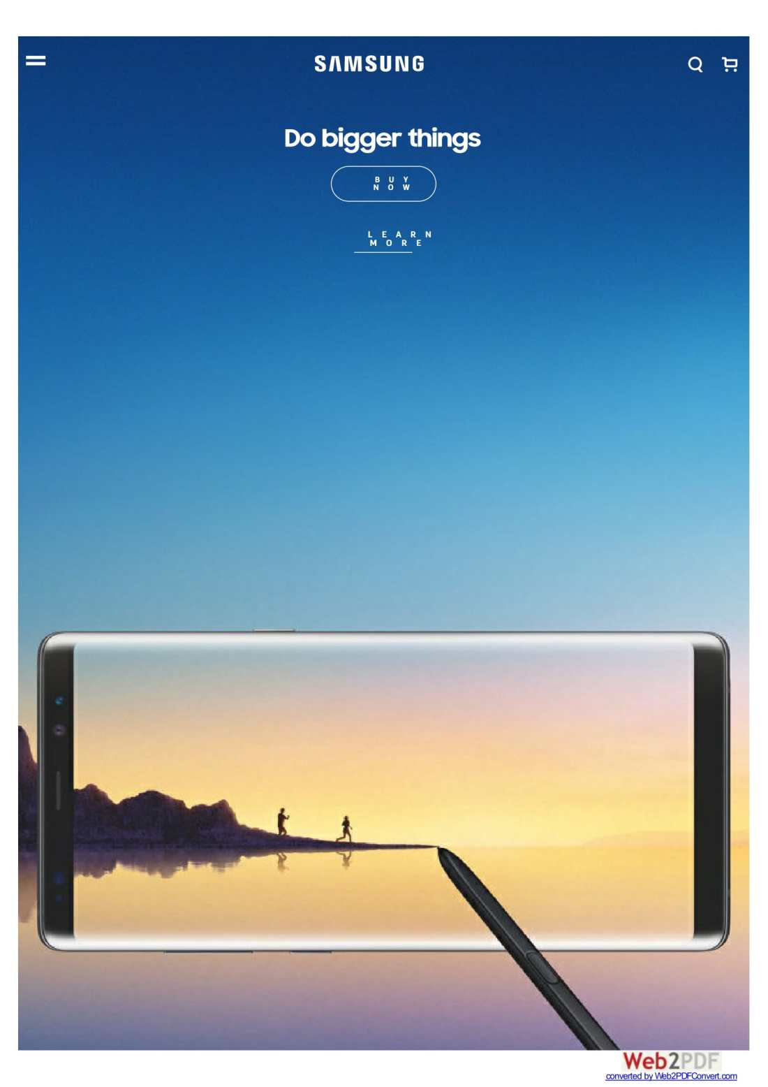

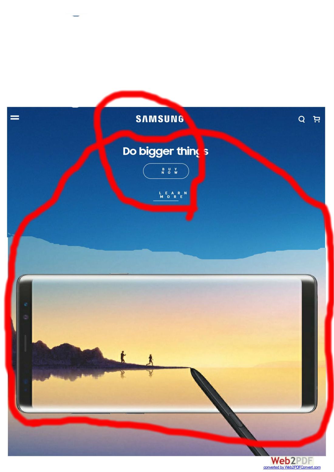
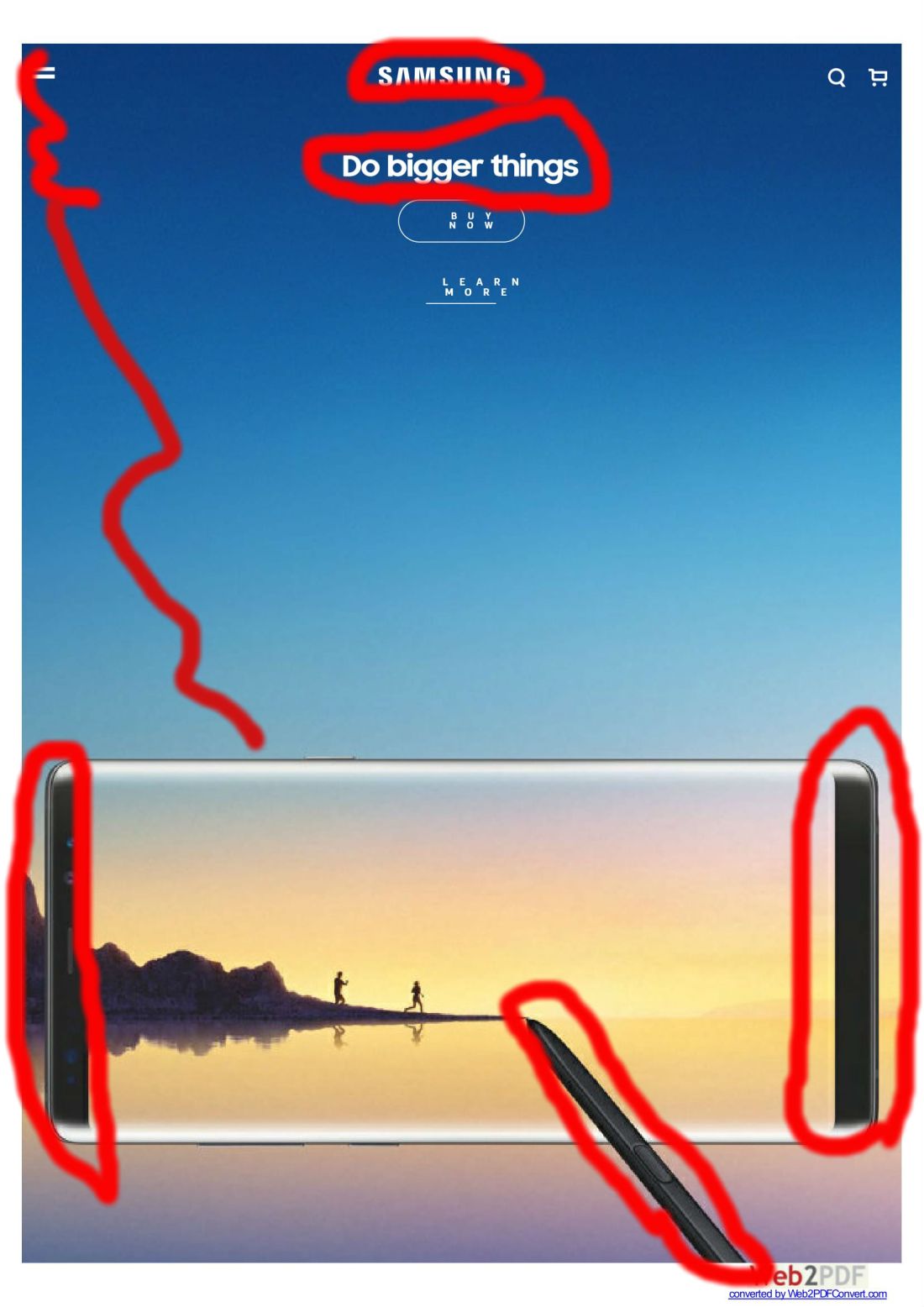 The contrast of the sides of the phone make this look almost like a mirror instead of a phone, giving the impression of just how clear the phone could be. The white words also give the impression of a clean separation between background and whats being said.
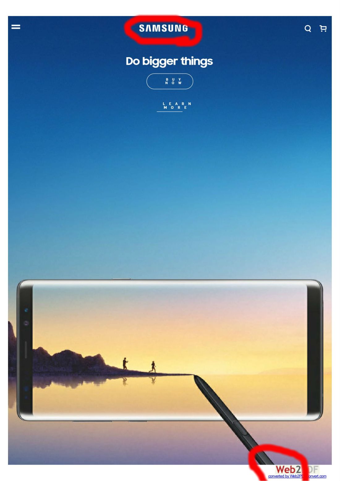 The logo “samsung” is seen several times in the webpage, only once though in this screen shot. It is also on the stylus and a few other places when you first get on the site and scroll a little.