


Minimum Expectations
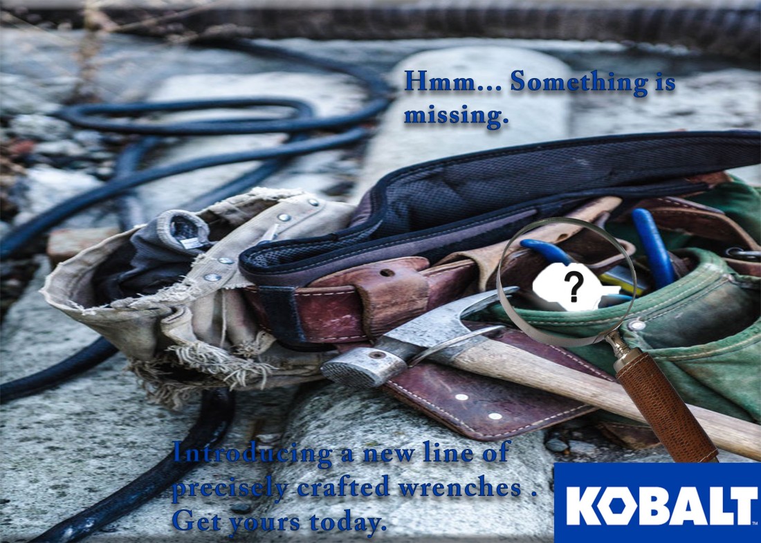
- Pick an Ad
- Well designed
- At least one line of text
- The company logo should be included
- Vector or raster based
- Create New Ad (This does not need to be a creative ad)
- Create a new unique ad (Photoshop or Illustrator)
- Match dimension of original ad (150 resolution)
- Must look like it is from the same campaign (Design, colors, typography, layout, visuals, message, etc)
- Type in your text (don’t copy/paste text or other elements from from original ad)
- Images or graphics need to be legally obtained (See course media usage requirements.)
- Find and use logo of company (fair use will apply here)
- Presentation Slide Design
- 6+ consistently designed slides (Use InDesign to layout slides – pull in ads from Photoshop or Illustrator)
- Reverse engineer original ad (Design | Color | Typography – pull out specific talking points over multiple slides)
- One or more slides pointing out what makes your new ad fit the campaign
- 10in by 7.5in slide size (InDesign document setup)
- One idea per slide
- 1+ slide introduce company and campaign
- Avoid bullet points
- Save as multi-page PDF and individual JPGs (Include either or both on your blog post)
Attribute
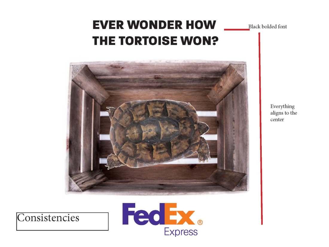
wooden box- George Hodan CC0 Public Domain
tesudo graeca 
| Vicente.niclos |
Audience
My intended audience was for adults that are wanting to ship things fast. It incorporates a nostalgic touch with the storybook tale, as well as a little bit of humour.
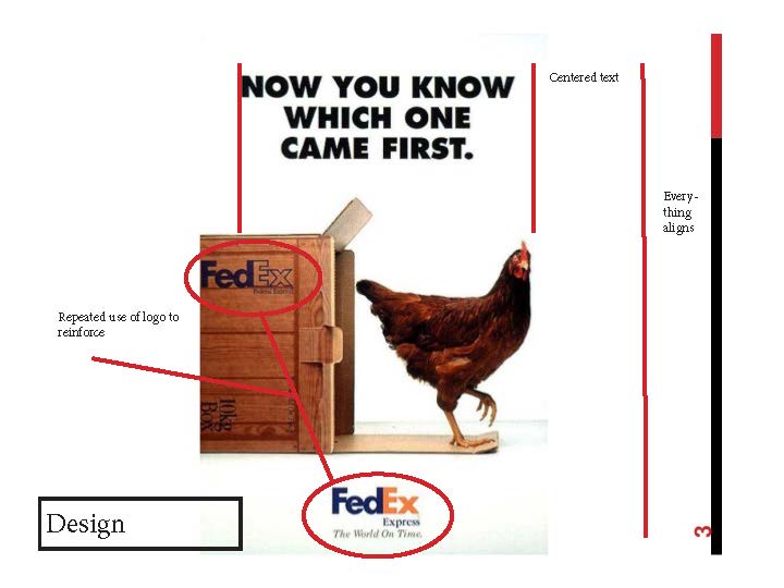
Design Analysis
The design is simple with a white background so that it looks similar to the campaign. The font is sans seriff and was as similar as I could find to the campaign font.